Saturday, December 20, 2008
Friday, December 19, 2008
IF: Remaining topics
Wednesday, December 17, 2008
Tuesday, December 16, 2008
Monday, December 15, 2008
Baltimore
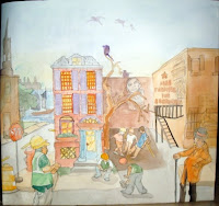
 This is my belated Baltimroe piece, quick bad photo, but I'm not sure how I feel about it. It's watercolors, and that's not really my forte. I wanted a feeling of the old and new, and a feeling of hope. Maybe the colors too everywhere? But the composition is true to my initial sketch for the most part.
Sunday, December 14, 2008
3 NEW YORK TIME BOOK REVIEWS
Friday, December 12, 2008
Wednesday, December 10, 2008
Final


Preliminary comps for EA Games "Snow Queen" proposal. Its based off Hans Christian Anderson's fairy tale "The Snow Queen" with a dark twist. I drastically altered the plot to fit my aesthetic and developed three environments/characters that correspond to the script I drafted. The original story line can be read here:
http://en.wikipedia.org/wiki/The_Snow_Queen
Monday, December 8, 2008
Sunday, December 7, 2008
I know it looks retarded so far, but...

Rough-rough-rough-ROUGH sketch of a spot for the New York Times Book Review of Stephen King's "Just After Sunset." I'm only posting this, at this level of shitty sketchyness, because I'm kinda stuck on the composition and am wary of going too much further.
My concept is supposed to communicate how "Just After Sunset" is a collection of short stories, rather than a novel, where each story seems like it could go off on its own and become a seperate book. So here, I have King with an axe after just chopping apart his book, and the bits and pieces of the pages are spawning into a bunch of smaller books instead of just laying dead. I feel like the whole cut-something-apart-and-it-only-multiplies-and-makes-things-worse idea is a common gag in horror (or maybe it was just on a Twilight Zone episode and I'm totally wrong) so I thought it'd be a fitting vehicle for King and how the NY Times believes his new book reads.
To clarify the concept on the finished piece, I plan on making his face more of a "Eureka!" instead of a "Haha, fuck you book!" and have rays coming up from the book, so it appears like it was a good idea, and not that King has resorted to self destruction or something.
In the background, will be your typical full moon and hazy clouds, very receeded.
And as for colors, I want to try psychadelic neons and black again, as if its a blacklight poster, without going nuts and screwing it up like last time. If its planned correctly, I think it'll make the image pop alot more and tie in with King's whole camp horror image.
But right now, the composition just doesn't seem to be all that it could. I have another of King's full body standing over the book, but that distances, and therefore, de-emphasizes his face, which is the selling point. Other crazier angles seem too impossible to pull off because nailing a recognizable caricature is difficult enough from a frontal view, let alone from some nutty bird's/worm's eye view. So I'm stuck between making it more dynamic, but without losing the recognizability of Stephen King.
Also, does that even LOOK like Stephen King? That's the best likeness I've gotten so far, and I'm probably going to model the re-drawn face after this one, but I can keep trying new ones if it doesn't read.
Saturday, December 6, 2008
Wednesday, December 3, 2008
Saturday, November 29, 2008
Monday, November 24, 2008
One scarlet letter concept sketch

Okay, so I'm doing a series of covers for Penguin American Classics. This is a concept sketch for a cover for the The Scarlet Letter. The type is very rough and misaligned, and the first "T" is an experiment for capitals, but that's the basic gist of the it, style-wise. I was trying to subtly show the secret relationship between Hester Prynne and the young minister, I forget his name. I feel like focusing on the actual scarlet letter "A" is kind of overdone. Instead I would incorporate the scarlet in the color scheme. This is only the first sketch I've done so let me know if the concept itself is lame, or if not, what could be improved with this one. I'll do more though. Also, no color yet, in case you didn't notice.
Friday, November 21, 2008
Baltimore

My intentions are to do a mural-ish horizontal. narrative like, sunset scene. With a church, old, and new building, and a vacant lot with kids playing in it and a painted mural to represent hope and an old man sitting in a chair, and construction guys working. I am a tad lost, but I will get back to it. I slightly changed directions, and got another idea, more poster-like. But I want to pursue idea 1 [nothing posted for that yet]
-Also, my apologies, for not being in class. I honestly overslept, woke up on my own at like 10:30ish and got to school at 12 and class apparently ended early. But I just wanted to post something up to show where I'm at. And the image was badly scanned and cropped.
Wednesday, November 19, 2008
Black Aggie
http://www.prairieghosts.com/druidridge.html
Fraternities would use the spot to haze pledges and so I focused on the rituals surrounding the legend of the statue at the height of its fame, and ultimately, where it was going.
It is not finished, I bit off way more than I could chew in two weeks. Any incite would be awesome.
Tuesday, November 18, 2008
balimore piece
Monday, November 17, 2008
Baltimore Piece
dis wat i got so far
Wednesday, November 12, 2008
Tuesday, November 11, 2008
Color Palette
Subscribe to:
Comments (Atom)


